What Your Object Detector Actually Sees in RF-DETR Feature Maps
You run the detector on a photo you know has a bird in it. Nothing comes back. Or something comes back, in roughly the wrong place, at 0.31 confidence, and you’re left staring at three numbers that don’t explain themselves.
So you lower the threshold. Then you raise it. Then you collect more images and retrain, and it gets a bit better, and you still don’t know why. I did this for a long time before it occurred to me that the model had already told me what it saw and I’d never looked.
The information is sitting in the feature maps, the intermediate outputs the model produces on the way from pixels to boxes. Every detector builds them. Almost nobody looks at them, because by default they have no viewable form.
What a feature map actually is
A backbone doesn’t scan your image hunting for objects. It rewrites the image into a different kind of data.
You start with a grid of pixels, three numbers each for red, green and blue. After the first stage you have a smaller grid where each position holds a few hundred numbers instead. Those numbers describe that patch: what kind of edge is here, what texture, and further in, what kind of object part. The network does this several times over. Each round gives a coarser grid with richer descriptions in it.
That grid of descriptions is a feature map, and it’s what the detection head reads. The head never sees your photo. It sees the last map the backbone produced and draws boxes from what that map says.
Which is the whole reason this is worth doing. When a detection goes wrong, the head is usually not the problem. The map it was handed is.
Why RF-DETR uses DINOv2
RF-DETR[1] builds its feature maps with DINOv2[2] , a vision transformer Meta trained without labels. That choice changes what ends up in the features, so it’s worth knowing before you look at them.
Most backbones are trained on a labelled dataset. A model trained on 80 COCO classes gets rewarded for the distinctions those 80 labels care about and nothing else. Its features specialise. They get sharp at telling a dog from a cat and stay blurry about anything no label ever asked about.
DINOv2 was trained on a different job. Take two crops of the same photo and produce matching descriptions of them. No categories anywhere in that objective. To do it well the model has to learn what things are in a general way, stable enough that the same object seen two ways lands in the same place. What comes out is a backbone that encodes parts, materials and boundaries nobody asked it for.
That generality is why the visualisation works at all. A label-trained backbone would show you the 80 distinctions it was paid to make. This one shows you what it found.
One resolution isn’t enough
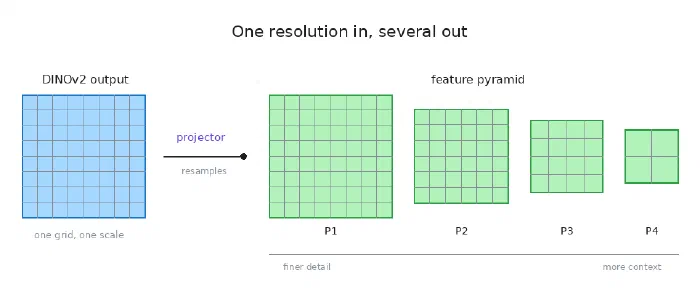
A vision transformer cuts an image into patches of one fixed size and describes each one. Every part of the image gets the same treatment at the same scale, and out comes a single grid at a single resolution.
Detection needs more than that. Finding a bird that fills the frame and finding that bird’s eye are different jobs. A coarse grid describes big objects efficiently and can’t pin down small ones. A fine grid locates small objects well, wastes computation on large ones, and sees too little context. Neither one works for both.
The standard fix is a feature pyramid[3] : several maps at several resolutions, so an object of any size has a scale that suits it. Every detector you’ve used since about 2017 does this.
RF-DETR needs a pyramid and DINOv2 hands it a flat single-scale output. A component called the projector sits between them and resamples that output into maps at different scales, all carrying the same meaning at different levels of spatial detail.
What the fusion step does
The pyramid levels aren’t much use on their own, because each is missing what the others have. Fine levels know where things are and not much about what they are. Coarse levels know what things are and are vague about where.
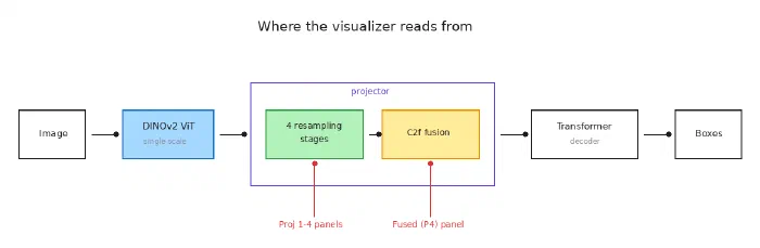
So the projector merges them back into one map using a C2f block, borrowed from YOLO[4] . The idea is to split the incoming features, send them down paths of different depths, then concatenate the results. Detail that only needs light processing survives. Semantics that need heavy processing get it. Neither one overwrites the other.
What comes out is a single fused map, and it’s the one worth staring at. It’s the last thing the backbone produces and the only thing the decoder receives. Everything the decoder knows about your image arrives through it. In the visualiser it’s the panel labelled “Projector Fused (P4)”, which is not the same thing as the panel labelled “Proj Level 4” however much the two names look alike. Level 4 is one of the inputs to the fusion. The fused panel is what came out.
If you only look at one panel, look at that one.
Why you can’t just look at a feature map
Here’s the practical obstacle. A feature map from this backbone has a shape like 40 by 40 by 256. The spatial part is fine. A 40 by 40 grid displays happily. The problem is the 256.
An image has three channels and your screen knows what to do with them. A feature map has hundreds and there’s no obvious way to squeeze that into something an eye can read.
Two shortcuts get used and both lose the plot. You can plot a single channel, but then you’re looking at one arbitrary slice out of 256 with no way to know whether you picked an informative one. Or you can average all the channels into a grayscale image, which sounds reasonable and destroys the thing you came for. Two regions the network describes in completely different ways can average to the same brightness and come out looking identical.
How PCA gets you from 256 channels to three
Stop thinking of the feature map as an image and think of it as a table. A 40 by 40 grid gives you 1,600 rows, one per position, each row a point in 256-dimensional space.
Those points aren’t spread evenly through that space. Learned representations are enormously redundant, so the data forms a stretched shape: wide along a handful of directions, nearly flat along everything else. Principal Component Analysis finds the wide ones. It locates the axis with the most variation, then the axis with the most remaining variation at right angles to it, and so on. Keep the first three, measure where every point falls along each, and you have three numbers per position instead of 256. Call them red, green and blue.
The result is readable because similar colours mean similar descriptions. Nothing in that calculation knows where the bird is. But positions the network describes in similar ways sit close together in 256-dimensional space, and points that are close stay close after projection. The object separates itself from the background without being asked to.
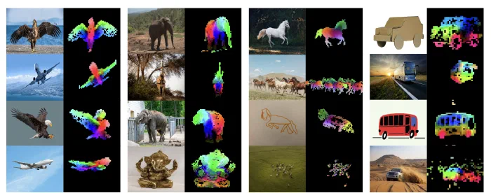
The DINOv2 paper opens with the same trick, and their version shows something one image can’t. Each column holds a group of related images, and the colouring stays consistent down the whole column. The same body part lands on the same colour across different animals, different poses, different art styles, even across a photograph and a bronze statue.
That consistency isn’t magic, it’s how the figure was made. They run PCA jointly over every image in a column rather than on each image separately[2] , so all of them get projected onto the same axes. Shared axes make the colours comparable. Run PCA per image, as the visualiser here does, and the colours only mean something inside that one picture.
How to read a panel
Which leaves an obvious question about your own output. If the colours only mean something inside a single image, what do they mean?
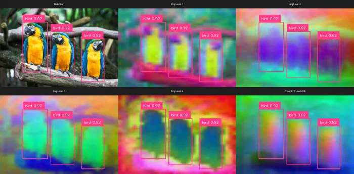
Look at the six panels at the top of this post. The birds come out yellow-green in the first projector level, purple in the second, green in the third, dark blue in the fourth, orange in the fused one. Same birds, same photo, five different colours.
The model didn’t change its mind between panels. PCA runs separately on each one, and which direction it picks as the first axis, and which end of that axis it treats as positive, both fall out of the arithmetic. Flip a sign and every colour inverts. Nothing in the output is anchored to anything you would recognise.
So don’t ask what a colour means. Purple isn’t bird, green isn’t background, and no reading of the palette will tell you otherwise.
Ask about separation instead. In all five of those panels the birds are one colour and the branch and foliage behind them are another, and the boundary falls roughly where it should. That is the model telling you it has encoded those regions as different kinds of thing. It’s the entire signal, and it holds no matter which way the axes happened to point.
Watching the levels in order shows you one more thing. In the first you can make out the yellow chest and the head as separate regions inside each bird, so there’s still fine detail in the map. By the fourth each bird is a single undifferentiated blob and the background has taken over the frame. The detail is gone and what’s left is a claim about what the whole region is. That’s the trade the pyramid exists to manage, happening where you can see it.
What this actually tells you
The clearest use is working out why a detection failed.
Look at the fused panel. If the object is clearly there and no box came back, the features were fine and your problem is downstream, in the decoder or in your threshold. If the object never separated from the background at all, the backbone didn’t encode it, and no amount of threshold tuning will help. From the outside those two failures look identical. They need opposite fixes.
The second use is knowing when to distrust a correct answer. A model can output the right box while working mostly off background context rather than the object. That prediction is right today and brittle tomorrow, and the confidence score gives you no warning at all. The feature map does.
Third, and less urgent, it’s a good way to learn the architecture. Watching a representation shift from texture to structure across the pyramid, then sharpen at the fusion step, makes the design concrete in a way no diagram managed for me.
Try it on your own images
The visualiser is one Python script. It runs a single forward pass, reads the four pyramid stages and the fused output, renders each through PCA, draws the detection boxes on every panel, and saves a labelled grid.
pip install rfdetr supervision
python visualize.py --image your_image.jpg
Use --model to switch between the small, medium, base and large variants, and
--threshold to move the detection cutoff. The source is
on GitHub.
None of this is specific to RF-DETR. Any PyTorch model will hand you its internal layers by name, and any feature map can be rendered this way. If you work with a different detector, find its equivalent of that fused map, the last thing the backbone passes forward, and look at what your model is actually working from.
Next time nothing comes back for a bird that’s obviously there, you won’t have to guess which half of the model to blame.
References
- I. Robinson, P. Robicheaux, M. Popov, D. Ramanan, and N. Peri, “RF-DETR: Real-Time Detection Transformer”, ICLR, 2026.
- M. Oquab, T. Darcet, T. Moutakanni, et al., “DINOv2: Learning Robust Visual Features without Supervision”, arXiv:2304.07193, 2023.
- T.-Y. Lin, P. Dollár, R. Girshick, K. He, B. Hariharan, and S. Belongie, “Feature Pyramid Networks for Object Detection”, CVPR, 2017.
- G. Jocher, A. Chaurasia, and J. Qiu, “Ultralytics YOLOv8”, GitHub, 2023.